Psychology of Conversion: How to Design Websites That Sell
A beautiful website isn't enough. It needs to work.
As a freelancer with a service or product, you already have experience with how people think and act. Now you need to use that knowledge ethically in your web design - to help the right clients find you.
A website helps you convert when the structure makes the choice easy for the visitor.
Start with three fundamental questions:
Can they see what's offered? Do they understand why it's relevant? Is the next step clear?
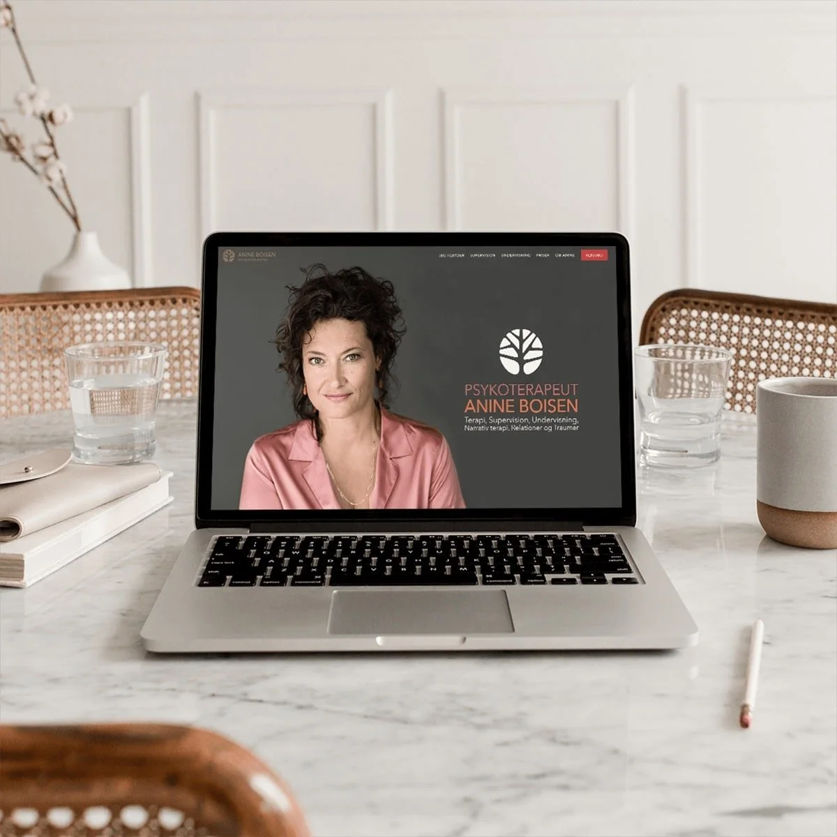
International award-winning web design by designcoach.dk for Psychotherapist Anine Boisen
Trust comes first
Visitors judge your credibility in 0.05 seconds. Their brain scans for signals of safety and competence.
Clear contact information signals accessibility. Professional photos (with names underneath) of you and pricing information in relevant places build instant credibility.
When the basics about you are clarified early, attention shifts from doubt to content. Customer testimonials at the top of the page show results immediately. Certifications and authorizations do the most good where decisions are made - at programs, pricing, or booking.
Cognitive load: Keep it simple
Your brain can only process limited information at a time. So can your potential customers. Clarity emerges when the number of choices is limited.
Keep your homepage to a maximum of three main options. For example: "Book consultation," "Read my book," and "See course offerings." Or: "Start here," "About me," and "Contact."
Keep one primary action per page. Write in short sections with headlines that actually inform. Let each section point toward the next natural step. Less mental noise and simplicity create action.
Social proof drives decisions
95% of purchases are unconscious. We copy others' behavior to make "safe" choices.
Recommendations work best at the moment doubt arises - for example, a short customer testimonial next to pricing.
Specific customer testimonials with names and preferably photos work strongest. For example: "Sarah helped me find balance again after burnout" or "My career change succeeded thanks to Maria's guidance."
Stats about your experience like "I've helped 150+ leaders with stress management" or "200+ career transitions facilitated" build credibility and show competence.
FAQ gives that extra push when someone is close to deciding. Relevance beats quantity: a few precise statements close to the buttons do more than long lists elsewhere.
The psychology of scarcity
Scarcity can nudge people to action. But use scarcity ethically and honestly.
"Only 3 available times in December" is concrete and credible. "First consultation for 15 new customers" creates action without pressure. "Next course starts in February" gives a natural deadline. "Limited to 10 participants" promises individual attention and quality.
Anchoring: First impressions matter
The first number your visitors see sets the reference and anchors price expectations.
Show the complete solution first to frame value - not to push upward, but to make the other choices easier to decode. Name programs after outcomes and goals. This strengthens the connection between price and expected results.
Language shapes perception. For example, "3-month program" sounds less than "12-week transformation."
Decisions are felt first - and justified afterward with logic
We make emotional decisions and rationalize them afterward.
The decision often begins with recognition: a situation, a desire, a pattern that needs breaking. Frustration with the status quo drives action. Hope for change motivates investment, and pride in investing in oneself can help justify the price.
Value calculations appeal to the logical brain. Time savings make value tangible. Comparison with alternatives positions your offering. Guarantees and security eliminate risk. A clear cancellation policy, ability to reschedule, or a short introductory conversation completes the argument.
Call-to-action that works
Buttons that describe the action convert better than typical word choices.
Instead of: "Contact me" Write: "Book your session"
Instead of: "Read more" Write: "Download your guide now"
Instead of: "Get started" Write: "Start your transformation"
Use action-first language. Avoid generic prompts.
Test and adjust
Start with four lifts: headline, primary image, placement of a relevant testimonial, and text on the most important button. Measure clicks on CTA and submitted forms over two weeks. Adjust one thing at a time.
Small changes can yield big results. A better headline can, for example, double conversions.
Conclusion
Good web design is also ethical applied psychology.
When direction, evidence, and language work together, the path from interest to action becomes shorter. The result is more relevant inquiries and a clearer match between need and solution.
Start with trust. Reduce complexity. Show social proof. Give value first.
Your website becomes both better and more converting.
FAQ
IHow long does it take to implement these principles? Most changes can be implemented over a weekend. Start with elements that affect trust first.
Do these principles work for all industries? Psychological principles are universal. Implementation should be adapted to your specific target audience and industry.
How do I measure the effect? Track conversion rates, time on page, and bounce rate. Google Analytics gives you this data for free.
Should my website be complex to appear professional? On the contrary. Simplicity signals confidence and expertise. Complexity creates doubt.

